

Contrast - a Principle of Design |
Contrast:
–noun
a large difference between two things; for example, hot and cold, green and red, light and shadow. Closely related to emphasis, a principle of design, this term refers to a way of juxtaposing elements of art to stress the differences between them.
Delahunt, Michael R. "Contrast." ArtLex Art Dictionary. 13 February 2011. <http://www.artlex.com>.
Contrast in an artwork can be any significant difference in art elements.
Shape Contrast shows a variety of shapes in an art work. Using organic shapes and geometric shapes together show the highest contrast.
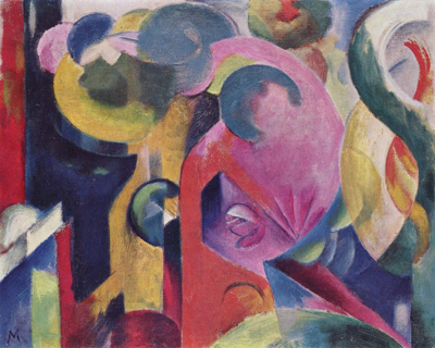
Franz Marc, Komposition III, 1914, oil on canvas, 46 x 57 cm, Karl-Ernst-Osthaus-Museum
Line Contrast shows a variety of line in an art work. This difference in line adds visual interest and is used to show value, depth, variety or emphasis. (Click on the image below for a closer look)

Aboriginal hollow log tombs - National Gallery Canberra
Size Contrast shows elements in a variety of sizes in an artwork. This difference in size adds visual interest and is used to show depth, variety and emphasis.
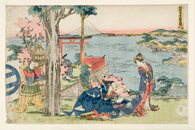
Katsushika Hokusai, Woodcut, 1806, 250 mm (9.84 in) x 380 mm (14.96 in)
Color Saturation Contrast shows a stark difference between highly saturated colors (pure hue) and desaturated colors (those dulled by neutralizing with the complementary color) This difference in saturation, or color brightness, adds visual interest and emphasis.
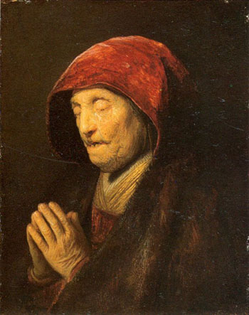
Rembrandt Harmenszoon van Rijn, Old Woman in Prayer, 1630, 16 x 12 cm
Warm - Cool Color Contrast shows a stark difference in warm color hues and cool color hues. Warm colors tend to advance forward while cool colors recede, showing depth in a composition.
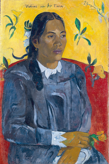
Paul Gauguin, Tahitian Women with a Flower, Oil, 1891, Ny Carlsberg Glyptotek
Texture Contrast shows a variety of surface textures in an artwork. This difference in texture adds visual interest and can show emphasis.
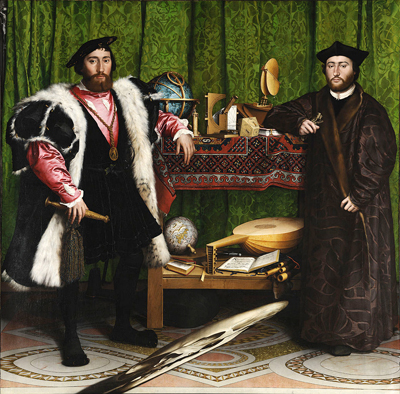
Hans Holbein the Younger, The Ambassadors, 1533, oil,209.5 cm (82.5 in) x 207 cm (81.5 in), National Gallery
Value Contrast uses a variety or difference in value (darks and lights of a color/hue) to show visual interest and to show depth, variety and emphasis.
N. C. Wyeth, Illustration from page 316 of The Boy's King Arthur, 1922
Simultaneous Contrast shows the difference between hues, specifically those that are the furthest from each other on the color wheel (complementary colors).
Placing complementary colors next to each other in a design can cause a visual vibration due to the contrast.
Shapes of identical, neutral colors placed on top of the complementary colors give the illusion of being different shades even though they are exactly the same.

Simultaneous Contrast - the grays look different on complimentary colors but are the same
All images on this page are in the public domain.
Web sites about Contrast:
Composition and Design: Elements, Principles and Visual Effects
Colors on the Web
Itten's Color Contrasts
Art Lesson: Principles of Design - Contrast
Some other artists who use Contrast in their work:
Wasily Kandinsky
Paul Klee
Henri Matisse