

an element of art |
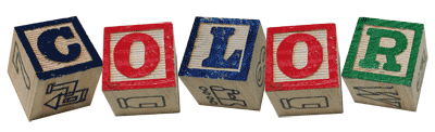
Color:
–noun
1. the quality of an object or substance with respect to light reflected by the object, usually determined visually by measurement of hue, saturation and brightness of the reflected light; saturation or chroma; hue.
"color." Dictionary.com Unabridged. Random House, Inc. 14 Nov. 2010. <Dictionary.com>
http://dictionary.reference.com/browse/color
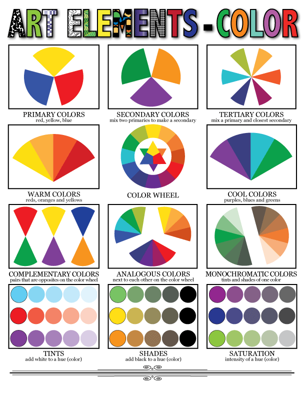
Hue is an individual color.
Primary Colors are those that cannot be made by combining any other colors; primary color pigments can be mixed to make all other colors.
Secondary Colors are made by mixing two primary colors.
Tertiary Colors are made by mixing a primary color with one of its nearest secondary colors.
Complementary Colors are colors that are opposite each other on the color wheel. They are very high contrast when used together in a composition.
In Paul Cézanne's painting below, the complementary colors of blue and orange are used to make the fruit stand out.
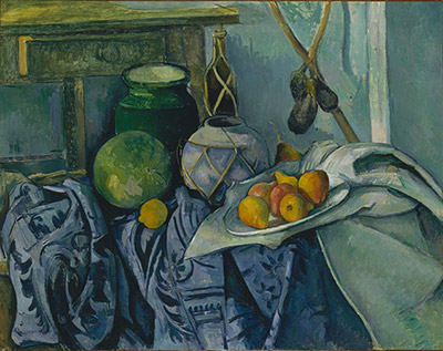
Paul Cézanne; Still Life with a Ginger Jar and Eggplants; (61.101.4) In Heilbrunn Timeline of Art History . New York: The Metropolitan Museum of Art, 2000–. http://www.metmuseum.org/toah/works-of-art/61.101.4. (December 2008)
Analogous Colors are colors that are near each other on the color wheel. They are very compatible and blend well when used in a composition.
Warm Colors are vivid and energetic. They advance in space and can pop out in a composition.
Cool Colors are serene and soothing. They recede in a composition so fall into the background easily.
El Greco's painting (below), he uses mostly blues and greens, or cool colors to evoke a mood.
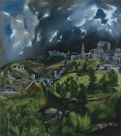
El Greco; View of Toledo; oil on canvas; 1599
Monochromatic Colors are the tints and shades of one color.
Tints are the high, lighter values of a color.
The painting below by Claude Monet uses the tints of various colors.
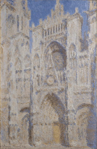
Claude Monet; Rouen Cathedral: The Portal (Sunlight); oil on canvas; 1894
Shades are the low, darker values of a color
Saturation is the brightness or dullness of a color. A highly saturated color is very bright while a desaturated color is very dull.
In Paul Klee's painting below, the contrast between highly saturated colors and desaturated colors is clearly seen.
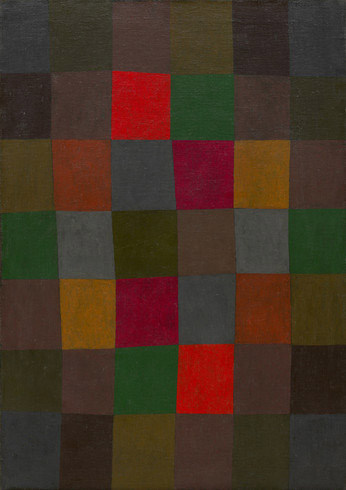
Paul Klee;New Harmony (Neue Harmonie), 1936. Oil on canvas, 36 7/8 × 26 1/8 inches (93.6 × 66.3 cm). Solomon R. Guggenheim Museum, New York 71.1960 © 2014 Artists Rights Society (ARS), New York / VG Bild-Kunst, Bonn
Click on poster above for a larger, printable version.
Here is a fun interactive site about color:
Color In Motion
Some sites about color:
Why are things colored?
Ye Olde Homemade Colour Wheel
Tiger Color: Basic Color Schemes - Introduction to Color
Serendip: Links to Color Web Pages
Work With Color: Color Definitions
Some artists who worked with color:
The Metropolitan Museum: The Fauves
Henri Matisse
Andre Derain
Georges Rouault
Gustav Klimt
Some contemporary artists who work with color:
Sal Jones
Takeshi Murata: Street Views
Lilla Kuizs
Kate Worm
David Hoffrichter
David Agenjo
Nikos Gyftakis
Mary Mosblech
Loriann Signori
Good Pinterest pages on color:
Pinterest: Art Education - Color
Pinterest: Art Ed - Color Theory
Pinterest: Art Education - Colored Pencils, Chalk, Pastels